
Since this design project spanned over four months, I will only give a brief overview of some of the most important aspects of the project which illustrate my progress as a designer. For me, the most important parts of the design process were the tour of the Pufferbelly Depot, the inspiration object, the artist research, the study model/3-D floor plan exploration, and the art gallery visit.
First, touring the Pufferbelly Depot at the beginning of the project was very beneficial. Seeing the building and learning about its historical importance made the project feel real and added context to the project. It also allowed me to understand the scale and proportions of the building. When I was designing, I constantly found myself thinking back to the depot tour to help me decide on things like ceiling heights and room dimensions. Overall, touring the depot made me feel more connected to the building, and designing for a space that I had actually visited made the design process much more realistic for me.


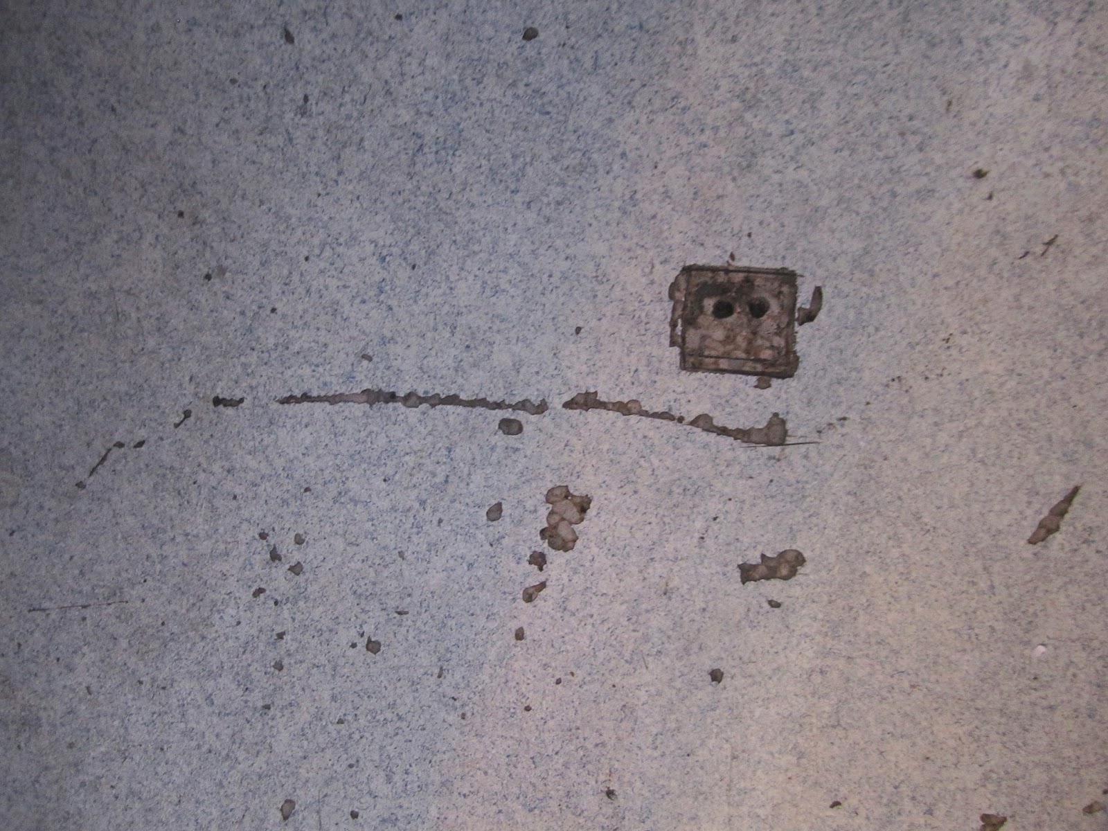
Here are a couple photos from the depot tour.
Also, choosing an inspirational object from the depot was a great way to develop a design concept that directly related to the Pufferbelly Depot. The anticipation of choosing an inspiration object caused me to pay close attention to the little details inside and outside the depot. Knowing that I would choose a part of the depot as my inspiration for the entire design, the depot tour was more beneficial and I was more invested in learning everything I could about the depot on our tour. I ended up choosing a place on the floor where the new flooring had been damaged and the original flooring could be seen as my inspiration object. From that, I took the ideas of layers, contrast, and the complex history of the building design concept.
Another valuable part of this project was researching and interviewing Jerri Lisk. Talking to a real artist (and client!) was a fun way to plan my design for the art gallery and studio. Jerri has been very friendly and helpful with sharing her work habits with me and expressing what she would like in an art studio. From my research and interviews with Jerri, I developed a program including all her wants and needs for the space. Having a real-life client that I could talk to about my ideas and about her desires for the space made designing the studio and gallery very fun, as I felt I was designing the space exactly the way she wanted it. Although my design will not actually be built, having Jerri as my client gave me a taste of what it is like to interact with clients and how great it feels to design something that improves someone's daily life.

Building a study model of the depot was extremely helpful in my design development. This was the first time I had built a model of an entire building-- not just one room. Although the model was meant to be sloppy, it helped me become familiarized with the building's footprint and the three-dimensional space in it. I used scraps of a cereal box to configure many different interior floor plans. This was my first time experimenting with space planning in three dimensions, and I found it to be very beneficial. Spatial scale is not easy for me to comprehend by looking at a two-dimensional drawing, and by making a scaled person to put inside my study model, I was able to more successfully comprehend the interior space within my design.

Study model interior

Final model

Final model
Finally, visiting an art gallery helped me learn how to best display art. Over spring break, I visited I went to Rima Fine Art Gallery in Scottsdale, Arizona. I really liked the gallery's use of paint colors and wall placement, and I incorporated the ideas from Rima into my own gallery design. Rima Fine Art Gallery featured white ceilings and moldings, light tan display walls, slightly darker walls which were not used for display, and dark flooring. The contrasting colors made the space aesthetically pleasing and interesting without distracting from the artwork. I used very similar colors in my own gallery design. Spending some time sketching and noticing the lighting, colors, walls types, and wayfinding in the gallery improved my understanding of how galleries can be designed.
To read more about my experience at Rima Fine Art Gallery, click here.

Throughout this project, I think my biggest improvements have been creativity, material specification, and concept application. Now that I am more familiar with some basic codes and standard sizes of interior elements, I have been able to focus more on designing spaces that are more outside of the box. I have also learned about interior materials this semester, and was able to make wiser decisions when specifying materials. Although I have always liked concept development and it is one of my strong points, I think the application of conceptual elements throughout my designs improved in this project.
No comments:
Post a Comment