
02 March 2014
THIS SITE HAS MOVED!
I created a new online portfolio which can be viewed here. It focuses on my recent work and skills rather than my progression throughout the years. Please check it out! :)
28 October 2013
Chicago Study Tour
This September, I visited Chicago for a week for a study tour with other WSU students from interior design, architecture, landscape architecture, and construction management. I had a great time seeing sites I had learned about in school and learning more about Chicago while visiting these famous historic sites. The week was packed full of tours, and I want to highlight a few of my favorite parts of the trip.
Before we went to Chicago, four of my peers and I researched the Railway Exchange or Santa Fe Building. Some of the main facts about the building is that it was designed by Daniel Burnham and Frederick P. Dinkelberg, and it was built in 1903-1904. The Santa Fe Building is covered in white terracotta to fit with the White City theme of the 1893 World Columbian Expo. Once in Chicago, my group members and I were placed into separate tour groups for Urban Classroom tours. Each of us were placed in separate groups and got to tell our other classmates about the Railway Exchange while inside it! It was a lot of fun to see a building I had learned so much about and share my knowledge with other students. While on our tour, I got to learn about buildings like The Rookery and the Harold Washington Library from some of my fellow students.

 Original column in The Rookery designed by Burnham and Root visible beneath Frank Lloyd Wright's remodel
 The Monadnock Building, one of the earliest skyscrapers
 The Railway Exchange Interior
Another of our Urban Classroom tours was at the Illinois Institute of Technology, or IIT. On this tour, we saw many designs by Ludwig Mies van der Rohe as well as the newer McCormick Tribune Campus Center by Rem Koolhaas.
Visiting the Merchandise Mart was another highlight of my trip. I was able to tour a few showrooms like Herman Miller and Designtex.
 Herman Miller Showroom
 Designtex Showroom
My group and I also visited the Farnsworth House and the John Hancock Observatory.

Van der Rohe's Farnsworth House

View from the John Hancock Observatory during a thunderstorm
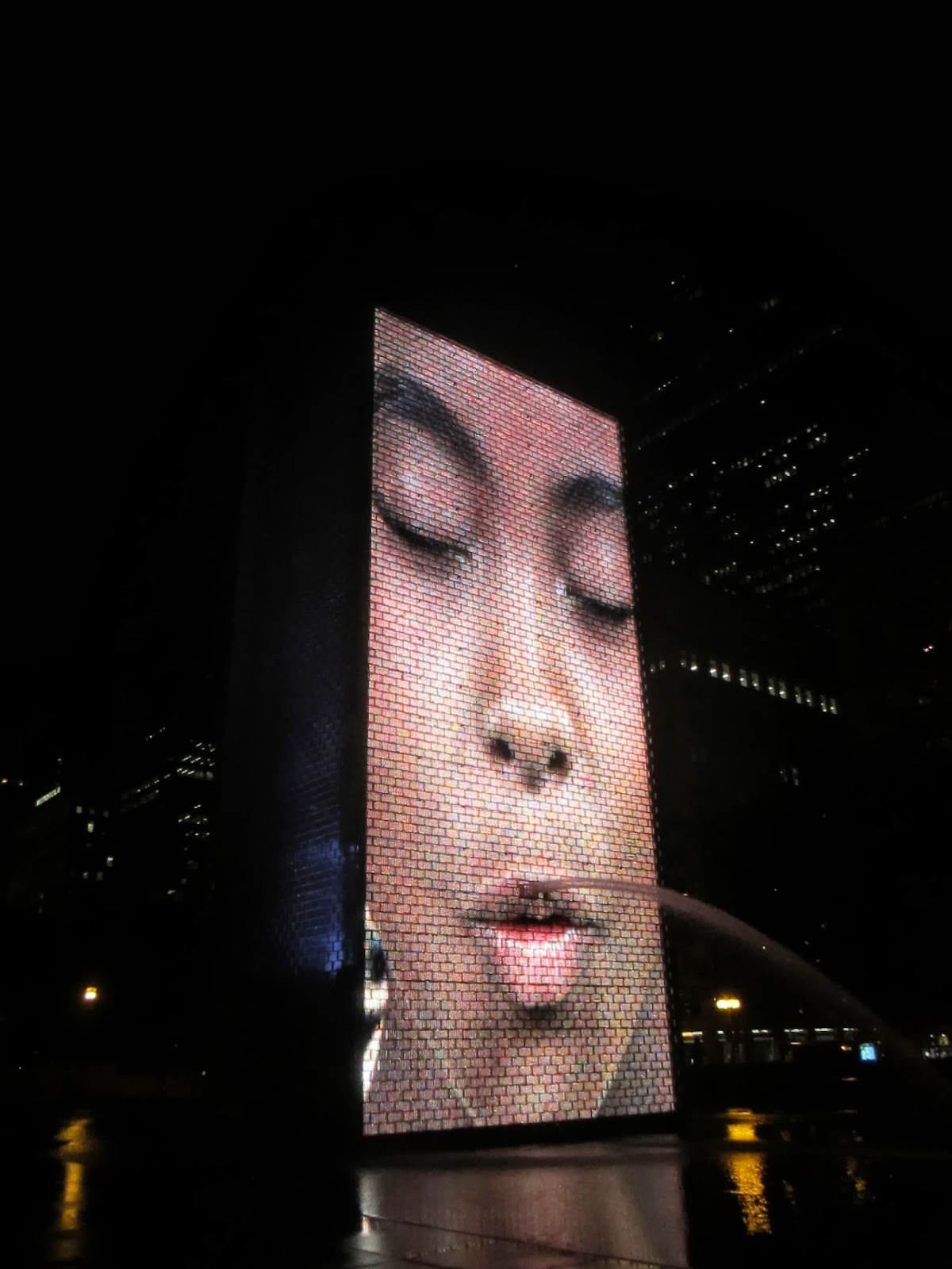
Our final Urban Classroom tour was in Millennium Park. Two of my favorite parts of the park were Frank Gehry's Jay Pritzker Pavillion and Jaume Plensa's Crown Fountain. Crown Fountain features two 50-foot towers with millions of LED lights to show about 1,000 Chicagoans faces spouting water out of the fountain.

Jay Pritzker Pavillion

Crown Fountain
Visiting Frank Lloyd Wright's Home and Studio in Oak Park was extremely informative and inspiring! I love that Frank Lloyd Wright continued to make changes in the house for as long as he lived in it in order to work for his growing family. He customized the house to make it fit his own family's needs rather than simply designing a building and putting his belongings into it.

Frank Lloyd Wright's Home
I also visited the Art Institute of Chicago where I was able to see famous pieces of artwork, such as American Gothic by Grant Wood and Sunday Afternoon on the Island of La Grande Jatte by Georges-Pierre Seurat-- a painting I have wanted to see for years.
I am thankful that I was able to go on this study tour. I had a blast and learned a lot!

Anish Kapoor's Cloud Gate at Millennium Park... The Bean!
Before we went to Chicago, four of my peers and I researched the Railway Exchange or Santa Fe Building. Some of the main facts about the building is that it was designed by Daniel Burnham and Frederick P. Dinkelberg, and it was built in 1903-1904. The Santa Fe Building is covered in white terracotta to fit with the White City theme of the 1893 World Columbian Expo. Once in Chicago, my group members and I were placed into separate tour groups for Urban Classroom tours. Each of us were placed in separate groups and got to tell our other classmates about the Railway Exchange while inside it! It was a lot of fun to see a building I had learned so much about and share my knowledge with other students. While on our tour, I got to learn about buildings like The Rookery and the Harold Washington Library from some of my fellow students.

The Rookery Staircase


Another of our Urban Classroom tours was at the Illinois Institute of Technology, or IIT. On this tour, we saw many designs by Ludwig Mies van der Rohe as well as the newer McCormick Tribune Campus Center by Rem Koolhaas.
Visiting the Merchandise Mart was another highlight of my trip. I was able to tour a few showrooms like Herman Miller and Designtex.


My group and I also visited the Farnsworth House and the John Hancock Observatory.

Van der Rohe's Farnsworth House

View from the John Hancock Observatory during a thunderstorm
Our final Urban Classroom tour was in Millennium Park. Two of my favorite parts of the park were Frank Gehry's Jay Pritzker Pavillion and Jaume Plensa's Crown Fountain. Crown Fountain features two 50-foot towers with millions of LED lights to show about 1,000 Chicagoans faces spouting water out of the fountain.

Jay Pritzker Pavillion
Crown Fountain
Visiting Frank Lloyd Wright's Home and Studio in Oak Park was extremely informative and inspiring! I love that Frank Lloyd Wright continued to make changes in the house for as long as he lived in it in order to work for his growing family. He customized the house to make it fit his own family's needs rather than simply designing a building and putting his belongings into it.

Frank Lloyd Wright's Home
I also visited the Art Institute of Chicago where I was able to see famous pieces of artwork, such as American Gothic by Grant Wood and Sunday Afternoon on the Island of La Grande Jatte by Georges-Pierre Seurat-- a painting I have wanted to see for years.
I am thankful that I was able to go on this study tour. I had a blast and learned a lot!

Anish Kapoor's Cloud Gate at Millennium Park... The Bean!


29 April 2013
Pufferbelly Depot Design
Since January, I have been working on a design for a local historical building. The Pufferbelly Depot, built in 1887, is a train station here in Pullman, Washington that I have used as a basis for a residence, art gallery, and artist's studio design. I researched an artist around whom I would design the studio and gallery. I chose Jerri Lisk of Boise, Idaho who creates large landscape paintings (up to 5'x6') on aluminum. In order to learn more about universal design, the residence is designed as if the artist's spouse were visually impaired.
Since this design project spanned over four months, I will only give a brief overview of some of the most important aspects of the project which illustrate my progress as a designer. For me, the most important parts of the design process were the tour of the Pufferbelly Depot, the inspiration object, the artist research, the study model/3-D floor plan exploration, and the art gallery visit.
First, touring the Pufferbelly Depot at the beginning of the project was very beneficial. Seeing the building and learning about its historical importance made the project feel real and added context to the project. It also allowed me to understand the scale and proportions of the building. When I was designing, I constantly found myself thinking back to the depot tour to help me decide on things like ceiling heights and room dimensions. Overall, touring the depot made me feel more connected to the building, and designing for a space that I had actually visited made the design process much more realistic for me.


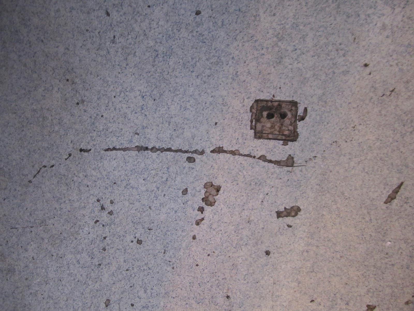
Also, choosing an inspirational object from the depot was a great way to develop a design concept that directly related to the Pufferbelly Depot. The anticipation of choosing an inspiration object caused me to pay close attention to the little details inside and outside the depot. Knowing that I would choose a part of the depot as my inspiration for the entire design, the depot tour was more beneficial and I was more invested in learning everything I could about the depot on our tour. I ended up choosing a place on the floor where the new flooring had been damaged and the original flooring could be seen as my inspiration object. From that, I took the ideas of layers, contrast, and the complex history of the building design concept.
 This is the photo I used for my inspiration.
Another valuable part of this project was researching and interviewing Jerri Lisk. Talking to a real artist (and client!) was a fun way to plan my design for the art gallery and studio. Jerri has been very friendly and helpful with sharing her work habits with me and expressing what she would like in an art studio. From my research and interviews with Jerri, I developed a program including all her wants and needs for the space. Having a real-life client that I could talk to about my ideas and about her desires for the space made designing the studio and gallery very fun, as I felt I was designing the space exactly the way she wanted it. Although my design will not actually be built, having Jerri as my client gave me a taste of what it is like to interact with clients and how great it feels to design something that improves someone's daily life.
 Here is a perspective drawing of the studio I designed.
Building a study model of the depot was extremely helpful in my design development. This was the first time I had built a model of an entire building-- not just one room. Although the model was meant to be sloppy, it helped me become familiarized with the building's footprint and the three-dimensional space in it. I used scraps of a cereal box to configure many different interior floor plans. This was my first time experimenting with space planning in three dimensions, and I found it to be very beneficial. Spatial scale is not easy for me to comprehend by looking at a two-dimensional drawing, and by making a scaled person to put inside my study model, I was able to more successfully comprehend the interior space within my design.


Finally, visiting an art gallery helped me learn how to best display art. Over spring break, I visited I went to Rima Fine Art Gallery in Scottsdale, Arizona. I really liked the gallery's use of paint colors and wall placement, and I incorporated the ideas from Rima into my own gallery design. Rima Fine Art Gallery featured white ceilings and moldings, light tan display walls, slightly darker walls which were not used for display, and dark flooring. The contrasting colors made the space aesthetically pleasing and interesting without distracting from the artwork. I used very similar colors in my own gallery design. Spending some time sketching and noticing the lighting, colors, walls types, and wayfinding in the gallery improved my understanding of how galleries can be designed.
To read more about my experience at Rima Fine Art Gallery, click here.
 This is the perspective drawing I drew for my gallery design.
Throughout this project, I think my biggest improvements have been creativity, material specification, and concept application. Now that I am more familiar with some basic codes and standard sizes of interior elements, I have been able to focus more on designing spaces that are more outside of the box. I have also learned about interior materials this semester, and was able to make wiser decisions when specifying materials. Although I have always liked concept development and it is one of my strong points, I think the application of conceptual elements throughout my designs improved in this project.
Since this design project spanned over four months, I will only give a brief overview of some of the most important aspects of the project which illustrate my progress as a designer. For me, the most important parts of the design process were the tour of the Pufferbelly Depot, the inspiration object, the artist research, the study model/3-D floor plan exploration, and the art gallery visit.
First, touring the Pufferbelly Depot at the beginning of the project was very beneficial. Seeing the building and learning about its historical importance made the project feel real and added context to the project. It also allowed me to understand the scale and proportions of the building. When I was designing, I constantly found myself thinking back to the depot tour to help me decide on things like ceiling heights and room dimensions. Overall, touring the depot made me feel more connected to the building, and designing for a space that I had actually visited made the design process much more realistic for me.


Here are a couple photos from the depot tour.
Also, choosing an inspirational object from the depot was a great way to develop a design concept that directly related to the Pufferbelly Depot. The anticipation of choosing an inspiration object caused me to pay close attention to the little details inside and outside the depot. Knowing that I would choose a part of the depot as my inspiration for the entire design, the depot tour was more beneficial and I was more invested in learning everything I could about the depot on our tour. I ended up choosing a place on the floor where the new flooring had been damaged and the original flooring could be seen as my inspiration object. From that, I took the ideas of layers, contrast, and the complex history of the building design concept.
Another valuable part of this project was researching and interviewing Jerri Lisk. Talking to a real artist (and client!) was a fun way to plan my design for the art gallery and studio. Jerri has been very friendly and helpful with sharing her work habits with me and expressing what she would like in an art studio. From my research and interviews with Jerri, I developed a program including all her wants and needs for the space. Having a real-life client that I could talk to about my ideas and about her desires for the space made designing the studio and gallery very fun, as I felt I was designing the space exactly the way she wanted it. Although my design will not actually be built, having Jerri as my client gave me a taste of what it is like to interact with clients and how great it feels to design something that improves someone's daily life.

Building a study model of the depot was extremely helpful in my design development. This was the first time I had built a model of an entire building-- not just one room. Although the model was meant to be sloppy, it helped me become familiarized with the building's footprint and the three-dimensional space in it. I used scraps of a cereal box to configure many different interior floor plans. This was my first time experimenting with space planning in three dimensions, and I found it to be very beneficial. Spatial scale is not easy for me to comprehend by looking at a two-dimensional drawing, and by making a scaled person to put inside my study model, I was able to more successfully comprehend the interior space within my design.

Study model interior

Final model

Final model
Finally, visiting an art gallery helped me learn how to best display art. Over spring break, I visited I went to Rima Fine Art Gallery in Scottsdale, Arizona. I really liked the gallery's use of paint colors and wall placement, and I incorporated the ideas from Rima into my own gallery design. Rima Fine Art Gallery featured white ceilings and moldings, light tan display walls, slightly darker walls which were not used for display, and dark flooring. The contrasting colors made the space aesthetically pleasing and interesting without distracting from the artwork. I used very similar colors in my own gallery design. Spending some time sketching and noticing the lighting, colors, walls types, and wayfinding in the gallery improved my understanding of how galleries can be designed.
To read more about my experience at Rima Fine Art Gallery, click here.

Throughout this project, I think my biggest improvements have been creativity, material specification, and concept application. Now that I am more familiar with some basic codes and standard sizes of interior elements, I have been able to focus more on designing spaces that are more outside of the box. I have also learned about interior materials this semester, and was able to make wiser decisions when specifying materials. Although I have always liked concept development and it is one of my strong points, I think the application of conceptual elements throughout my designs improved in this project.
18 March 2013
Impaired Vision Experience
A few classmates and I got a glimpse into the daily life of a person with impaired vision. We wore sunglasses with petroleum jelly smeared on the inside of the lenses and walked around our school's union building, the CUB. We also looked through resealable baggies to see a newspaper as a visually impaired person would and looked through a vision simulator tool.
We each completed tasks like walking up and down stairs, using an elevator, and using an ATM. Going down stairs is difficult with a visual impairment, and it is hard to see where the stairs end. The railings on the staircases, however, are very helpful because they are metal and reflect light which makes them easier to see. Using elevators is difficult because the buttons outside the elevator are not well marked. The biggest problem with the buttons is that at one set of elevators, the fire alarm button is the same size and shape as the up and down buttons-- one of my partners almost pushed that button by accident! My group and I visited multiple ATMs, and some are easier to use than others. The credit card slots feature green lights, and all the keypads have a braille bump on the number 5. The enter and exit keys were green and red on the ATMs, but were not bright enough to even be noticeable for someone with a visual impairment. Our union building features a lot of bright colors and high contrast, which are generally great for someone who is visually impaired, but these contrasts are not necessarily in the right places in the CUB. The biggest contrast issue was the glass doors entering the bookie. The doors have no frames, so it is hard to tell whether a door is open or closed.


 My group and I were unable to read a newspaper through a plastic baggie. We first tried to read the paper through two layers of plastic, and I could only read the title of the newspaper and headlines. Through four layers of plastic, I everything was much blurrier, but I was still able to read the big headlines.
 The vision simulator tool, a piece of plastic with different sections through which to look, showed people with various visual impairments see. I thought the tunnel vision tool was most helpful in understanding that particular kind of visual impairment, which removes all peripheral vision.
Light, colors, and general shapes were most visible in this experience. Overall, the most important design features for someone with a visual impairment include good lighting, contrasting colors, and sound cues. It is crucial that stairs, railings, doorways, walls, and corners are well lit and high contrasting to allow the most comfort for use by a person who is visually impaired. Sound cues, like at elevators, are also helpful. In a residence, sounds from water features to wind chimes can help orient a person in a space.
We each completed tasks like walking up and down stairs, using an elevator, and using an ATM. Going down stairs is difficult with a visual impairment, and it is hard to see where the stairs end. The railings on the staircases, however, are very helpful because they are metal and reflect light which makes them easier to see. Using elevators is difficult because the buttons outside the elevator are not well marked. The biggest problem with the buttons is that at one set of elevators, the fire alarm button is the same size and shape as the up and down buttons-- one of my partners almost pushed that button by accident! My group and I visited multiple ATMs, and some are easier to use than others. The credit card slots feature green lights, and all the keypads have a braille bump on the number 5. The enter and exit keys were green and red on the ATMs, but were not bright enough to even be noticeable for someone with a visual impairment. Our union building features a lot of bright colors and high contrast, which are generally great for someone who is visually impaired, but these contrasts are not necessarily in the right places in the CUB. The biggest contrast issue was the glass doors entering the bookie. The doors have no frames, so it is hard to tell whether a door is open or closed.


Light, colors, and general shapes were most visible in this experience. Overall, the most important design features for someone with a visual impairment include good lighting, contrasting colors, and sound cues. It is crucial that stairs, railings, doorways, walls, and corners are well lit and high contrasting to allow the most comfort for use by a person who is visually impaired. Sound cues, like at elevators, are also helpful. In a residence, sounds from water features to wind chimes can help orient a person in a space.
15 March 2013
Art Gallery Experience
I visited Rima Fine Art Gallery in Scottsdale, Arizona where one of my interior design teachers, Carrie Vielle, has an exhibit. It was fun to see her work in a gallery with artists like Renoir and Picasso.


The most efficient part of the gallery's design, in my opinion, is its method of allowing the public to see inside the gallery without very much sunlight. The awning outside and small movable walls at the front of the gallery both protect the artwork from the sun and without blocking the art from the public.

07 December 2012
Client Brief
A few months ago, before I began designing any part of the apartment building, I met with the client to discuss his vision for the project. I prepared a client brief discussing his main goals and ideas for the space so that I could create a design the client would like. Then, I created adjacency and critera matrices prioritizing my plans for the space with the client's needs in mind. Interviewing the client helped me understand his ideas for the space and improved my ability to combine my design ideas with the client's.


Subscribe to:
Comments (Atom)